

<body> of the pages on which the widget should appear. The widget is served from the Volubile CDN and connects to your agent automatically.
The snippet is available in two integration modes.
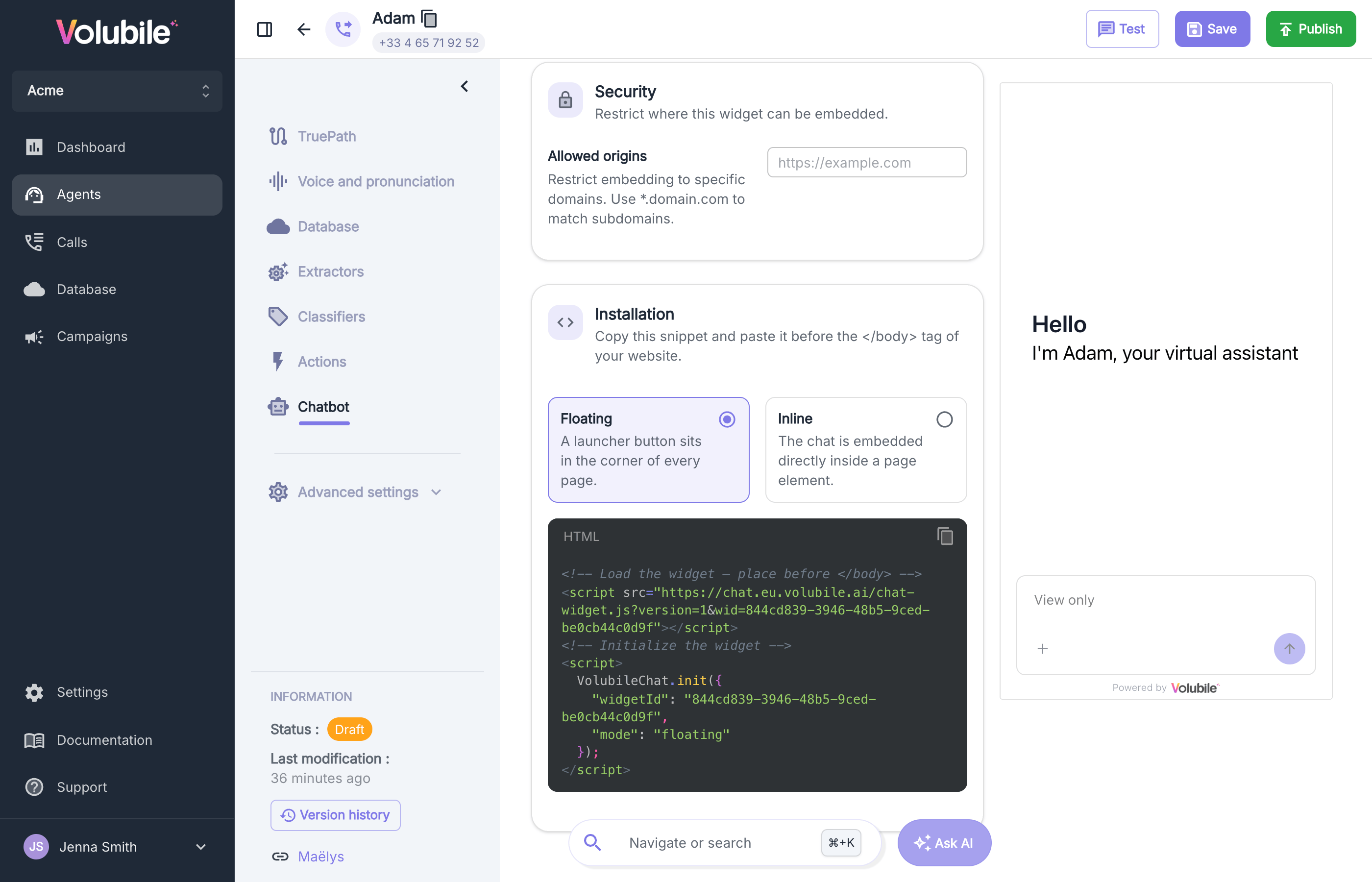
- Floating
- Inline
The widget is displayed as a floating launcher button that opens the chat window on demand. This mode is suited to most websites and requires no change to your page layout.
Advanced options
VolubileChat.init() accepts optional parameters that let you associate a conversation with one of your users and pass additional context to the agent. Add them manually to the generated snippet. The values you provide are attached to the conversation and can be reviewed later from the Conversations view.
The widget renders within an isolated container, ensuring that its styles do not interfere with those of your website and vice versa.
Overriding the configuration (optional)
The configuration defined in the agent applies to every page on which the widget is embedded. When needed, you can override any of these settings at initialization by passing alocalConfig object to VolubileChat.init(). The values you provide are merged over the saved configuration, so you only specify the fields you want to change.
This is useful to adapt the widget per page or per context — for example, a specific welcome message on your pricing page, or colors that match a particular section of your website.
The following fields can be overridden: language, privacyPolicyUrl, theme (primaryColor, backgroundColor, textColor, borderRadius, fontFamily), display (title, welcomeMessage), and behaviour (messageSizeLimit, inactivityTimeout, attachments).
In floating mode, localConfig also accepts zIndex (default 99999) — the stacking order of the floating widget. Increase it if the widget appears behind elements of your website.
In floating mode, localConfig.display also accepts iconSize (default 44) — the launcher button size, in pixels.
Custom launcher logo
In floating mode, you can display your own logo in place of the default launcher icon. Set the address (URL) of your image inlocalConfig.display.launcherLogoSrc, as shown in the example below.
Accepted format
- An image URL pointing to an SVG, PNG, or WebP file, or an inline
data:URI. - The logo is rendered inside an
<img>element. For security, any script or interactivity embedded in an SVG is ignored by the browser — provide a static, already-colored image. The logo does not inherit the widget theme color, so bake the final colors into the asset.
- Use a square image; it is scaled to the launcher size (
iconSize, default44px) and centered. - Recommended: at least 88×88 px (2× for retina displays), transparent background.
- Keep it small — ≤ 20 KB when hosted, or ≤ 10 KB for an inline
data:URI to avoid bloating the host page.
- Must be served over HTTPS.
- Must be publicly accessible (no authentication).
- Can live on your own domain (absolute or relative URL), any HTTPS host, or be embedded inline as a
data:URI. No CORS configuration is required for<img>.