> ## Documentation Index
> Fetch the complete documentation index at: https://docs.volubile.ai/llms.txt
> Use this file to discover all available pages before exploring further.
# Dashboard
> Comprehensive view of your call center's performance
## Analytics Dashboard
The analytics dashboard provides real-time visibility into your call center metrics, enabling data-driven decision-making and operational optimization.
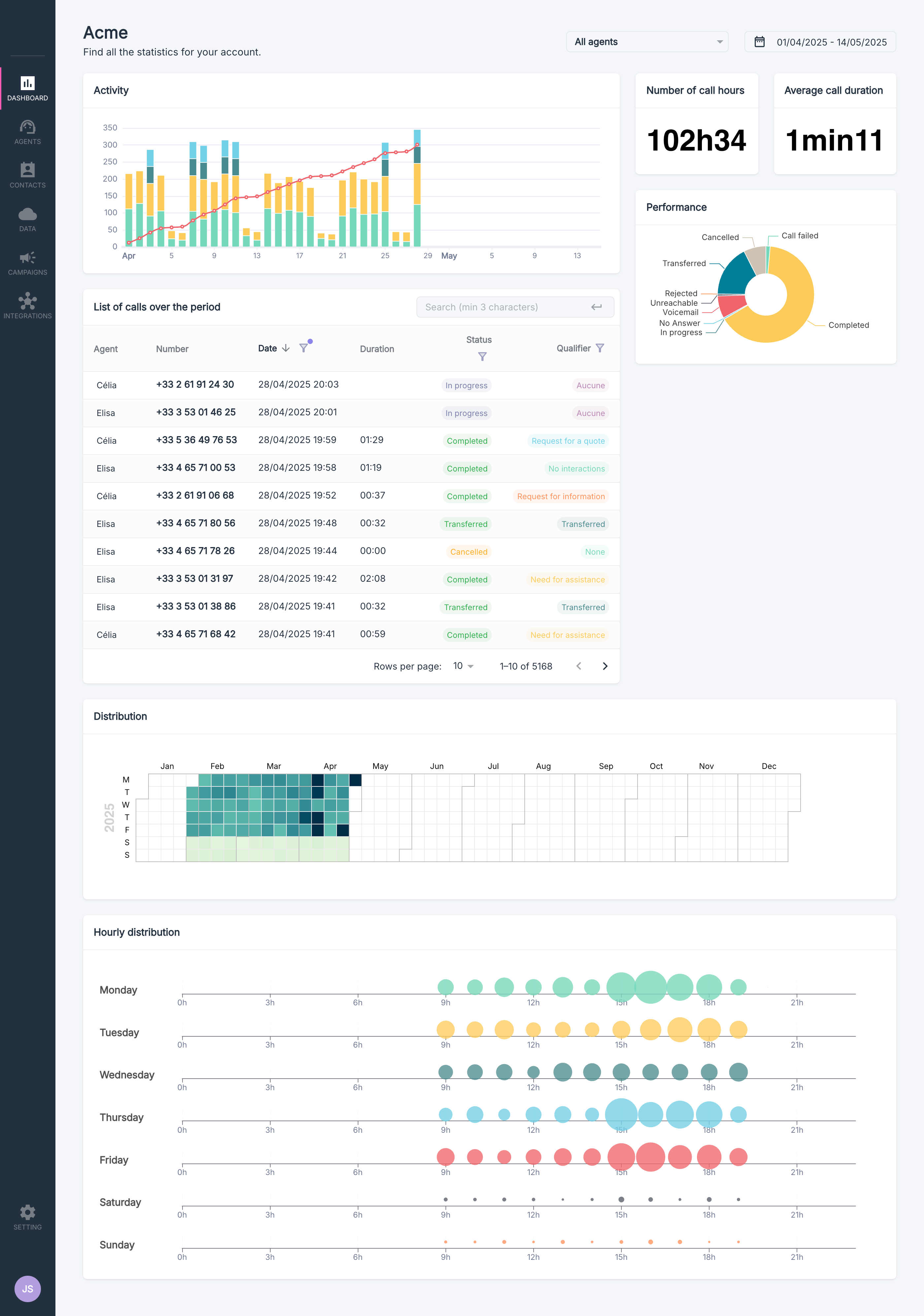 Filter the data by selecting specific start and end dates
View metrics for individual agents or for all your agents
Analyze trends through interactive graphs and charts
Refine your analysis by filtering with segmentation or manual tags
## Activity Visualization
Filter the data by selecting specific start and end dates
View metrics for individual agents or for all your agents
Analyze trends through interactive graphs and charts
Refine your analysis by filtering with segmentation or manual tags
## Activity Visualization
 ### Overview
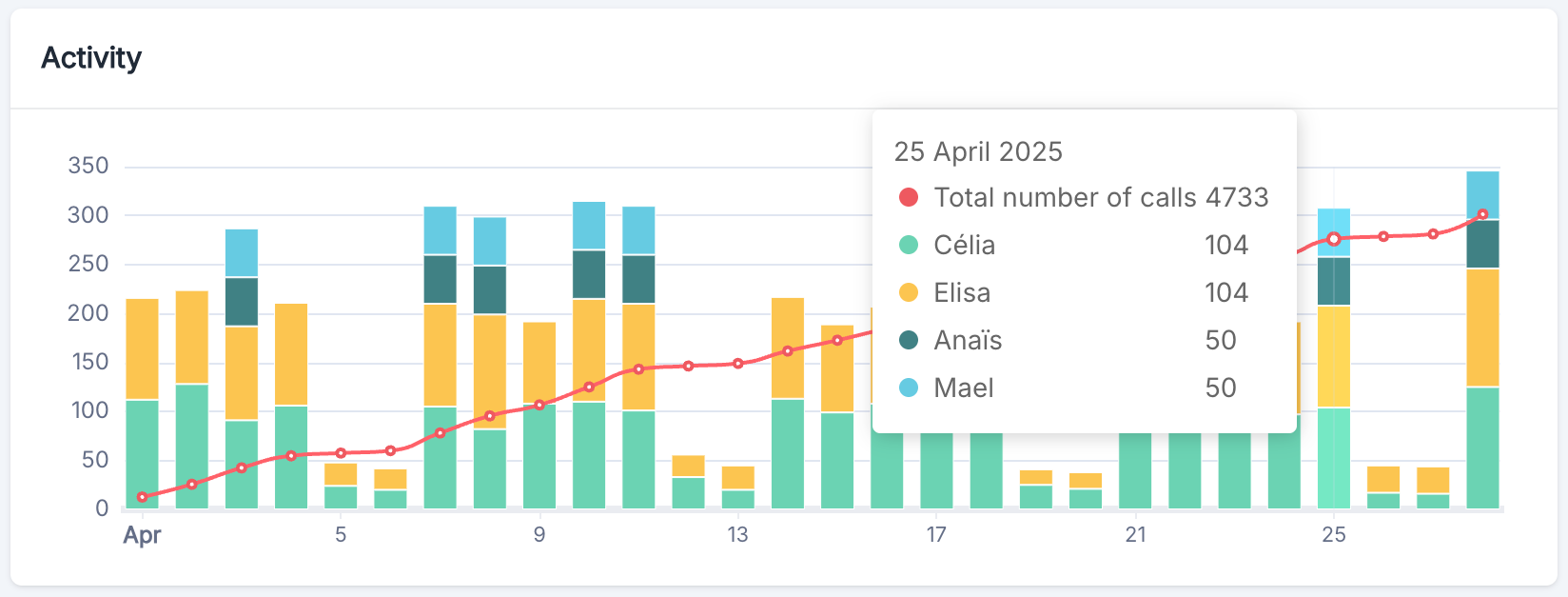
The activity graph is an essential tool for monitoring usage trends of your conversational agent system. It presents data in a combined chart displaying:
* **Stacked Bar Chart**: Represents the daily distribution of activities by agent
* **Trend Line**: Indicates the cumulative evolution of interactions over the period, providing a clear visualization of platform usage growth
### Trend Analysis
To make the most of this graph:
1. **Identify Patterns**: Analyze color distributions to understand call allocation
2. **Spot Anomalies**: Detect unusual peaks or declines that require investigation
3. **Plan Resources**: Use historical trends to anticipate future needs
4. **Measure Growth**: Track the slope of the trend line to evaluate platform adoption
## Key Indicators
### Overview
The activity graph is an essential tool for monitoring usage trends of your conversational agent system. It presents data in a combined chart displaying:
* **Stacked Bar Chart**: Represents the daily distribution of activities by agent
* **Trend Line**: Indicates the cumulative evolution of interactions over the period, providing a clear visualization of platform usage growth
### Trend Analysis
To make the most of this graph:
1. **Identify Patterns**: Analyze color distributions to understand call allocation
2. **Spot Anomalies**: Detect unusual peaks or declines that require investigation
3. **Plan Resources**: Use historical trends to anticipate future needs
4. **Measure Growth**: Track the slope of the trend line to evaluate platform adoption
## Key Indicators
 ### Overview
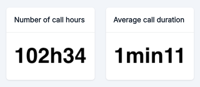
The dashboard presents two key KPIs:
This metric indicates the total accumulated time of voice communication handled by your AI agents
This metric represents the average duration of each phone interaction handled by the system
### Call Volume Analysis
The total number of call hours is a crucial indicator that allows you to:
* **Measure the Load** on the call processing system
* **Plan Capacities** based on usage trends
* **Evaluate the Return on Investment** of the Volubile platform
For a thorough analysis, compare this metric to equivalent prior periods to identify growth trends or seasonal variations.
### Average Duration Analysis
The average call duration reflects:
* **The Efficiency of Resolution** of requests by your AI agents
* **The Average Complexity** of processed inquiries
* **User Experience** in terms of service speed
An abnormally high average duration may indicate difficulties in understanding or resolving issues by the AI agents, while an overly short duration could signal premature disconnections.
## Performance Distribution
### Overview
The dashboard presents two key KPIs:
This metric indicates the total accumulated time of voice communication handled by your AI agents
This metric represents the average duration of each phone interaction handled by the system
### Call Volume Analysis
The total number of call hours is a crucial indicator that allows you to:
* **Measure the Load** on the call processing system
* **Plan Capacities** based on usage trends
* **Evaluate the Return on Investment** of the Volubile platform
For a thorough analysis, compare this metric to equivalent prior periods to identify growth trends or seasonal variations.
### Average Duration Analysis
The average call duration reflects:
* **The Efficiency of Resolution** of requests by your AI agents
* **The Average Complexity** of processed inquiries
* **User Experience** in terms of service speed
An abnormally high average duration may indicate difficulties in understanding or resolving issues by the AI agents, while an overly short duration could signal premature disconnections.
## Performance Distribution
 ### Overview
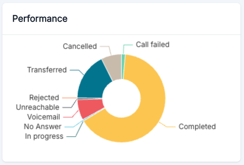
The performance distribution graph breaks down call results by their final status, providing insights into service quality and operational efficiency.
* **Completed**: Calls that were successfully managed and concluded normally by the agent
* **Call failed**: Technical failures during the call attempt (network issues, system errors)
* **Transferred**: Calls that required transfer to a human agent or another service
* **Cancelled**: Calls that were explicitly hung up by the caller before the agent answered
* **Rejected**: Calls that were rejected by the system (premium rate number, international calls)
* **Unreachable**: Call attempts that went unanswered by the recipient
* **No Answer**: Numbers that could not be reached (busy line, phone turned off, etc.)
* **Voicemail**: Calls that reached a voicemail
* **In Progress**: Calls currently being processed by the system
* **Handled by failover**
### Performance Interpretation
* **High Completion Rates** indicate effective call management
* **Frequent Transfers** may suggest knowledge gaps
* **Failed Calls** should be examined to identify technical issues
* **High Unreachable Rates** may indicate quality issues in the contact database
## Call Classification
### Overview
The performance distribution graph breaks down call results by their final status, providing insights into service quality and operational efficiency.
* **Completed**: Calls that were successfully managed and concluded normally by the agent
* **Call failed**: Technical failures during the call attempt (network issues, system errors)
* **Transferred**: Calls that required transfer to a human agent or another service
* **Cancelled**: Calls that were explicitly hung up by the caller before the agent answered
* **Rejected**: Calls that were rejected by the system (premium rate number, international calls)
* **Unreachable**: Call attempts that went unanswered by the recipient
* **No Answer**: Numbers that could not be reached (busy line, phone turned off, etc.)
* **Voicemail**: Calls that reached a voicemail
* **In Progress**: Calls currently being processed by the system
* **Handled by failover**
### Performance Interpretation
* **High Completion Rates** indicate effective call management
* **Frequent Transfers** may suggest knowledge gaps
* **Failed Calls** should be examined to identify technical issues
* **High Unreachable Rates** may indicate quality issues in the contact database
## Call Classification
 ### Overview
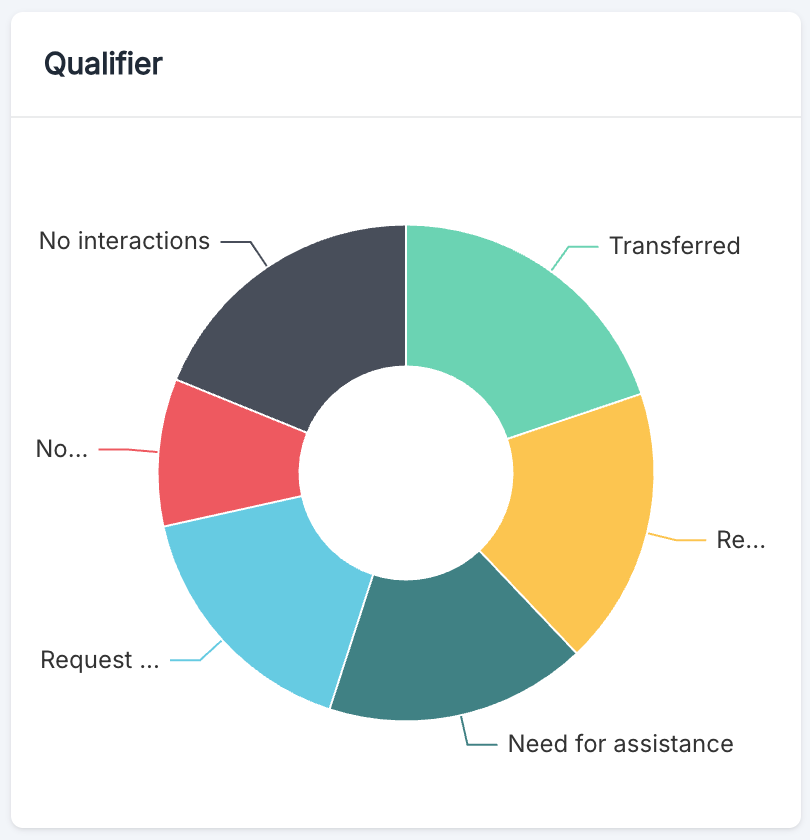
The Volubile classification module provides an analytical perspective on the classification patterns and outcomes of phone conversations managed by your AI agents. This visualization helps identify types of interactions and measures the efficiency of the system in categorizing calls.
### Best Practices
To maximize the value of classification data:
1. **Regularly Review Your Classification Taxonomy** to adapt it to your evolving business
2. **Analyze Temporal Trends** in category distribution
## Recent Calls Table
### Overview
The Volubile classification module provides an analytical perspective on the classification patterns and outcomes of phone conversations managed by your AI agents. This visualization helps identify types of interactions and measures the efficiency of the system in categorizing calls.
### Best Practices
To maximize the value of classification data:
1. **Regularly Review Your Classification Taxonomy** to adapt it to your evolving business
2. **Analyze Temporal Trends** in category distribution
## Recent Calls Table
 ### Table Structure
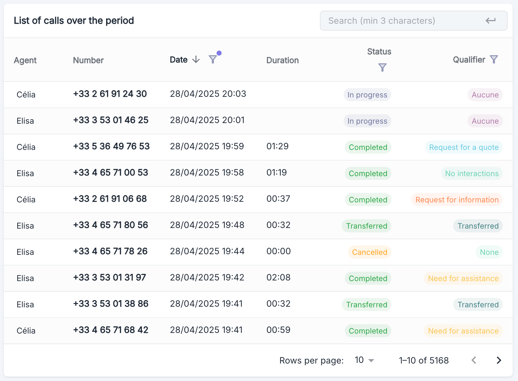
| Column | Description |
| -------------- | ------------------------------------------------------------------------------------------------- |
| Agent | Name of the agent handling the call |
| Number | Phone number associated with the call |
| Date | Date and time of the call |
| Duration | Length of the call (if applicable) |
| Status | Current status of the call (Completed, In Progress, Transferred, Canceled) |
| Classification | Additional classification based on the purpose of the call (Quote Request, Need Assistance, etc.) |
Use of the calls dashboard
## Distribution Analysis
### Monthly Distribution
### Table Structure
| Column | Description |
| -------------- | ------------------------------------------------------------------------------------------------- |
| Agent | Name of the agent handling the call |
| Number | Phone number associated with the call |
| Date | Date and time of the call |
| Duration | Length of the call (if applicable) |
| Status | Current status of the call (Completed, In Progress, Transferred, Canceled) |
| Classification | Additional classification based on the purpose of the call (Quote Request, Need Assistance, etc.) |
Use of the calls dashboard
## Distribution Analysis
### Monthly Distribution
 #### Overview
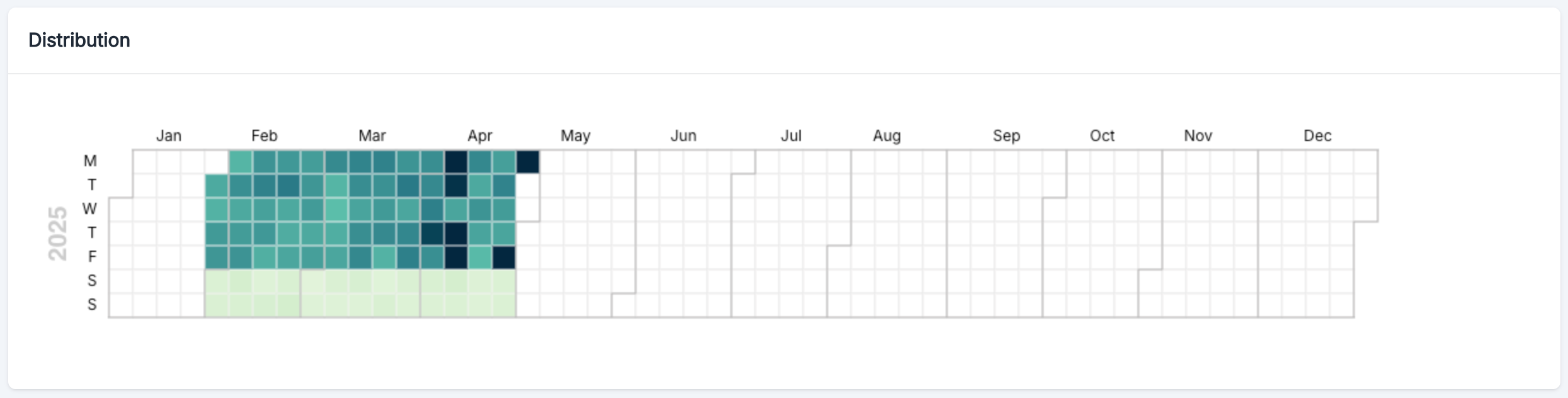
The calendar heatmap provides a visual representation of call volume patterns throughout the year where:
* The horizontal axis represents the months of the year (January to December)
* The vertical axis represents the days of the week (Monday to Sunday)
* The intensity of the color indicates the volume of calls (darker = higher volume)
#### Practical Use Cases
The distribution visualization can be used to:
* **Identify Seasonal Peaks** - Spot periods of the year when call volume significantly increases
* **Analyze Weekly Trends** - Observe which days of the week generate more activity
* **Measure Campaign Impact** - Assess the effects of marketing campaigns on call volume
Weekends (Saturday and Sunday) are often represented with a different intensity, generally indicating a reduced call volume compared to weekdays.
### Hourly Distribution
#### Overview
The calendar heatmap provides a visual representation of call volume patterns throughout the year where:
* The horizontal axis represents the months of the year (January to December)
* The vertical axis represents the days of the week (Monday to Sunday)
* The intensity of the color indicates the volume of calls (darker = higher volume)
#### Practical Use Cases
The distribution visualization can be used to:
* **Identify Seasonal Peaks** - Spot periods of the year when call volume significantly increases
* **Analyze Weekly Trends** - Observe which days of the week generate more activity
* **Measure Campaign Impact** - Assess the effects of marketing campaigns on call volume
Weekends (Saturday and Sunday) are often represented with a different intensity, generally indicating a reduced call volume compared to weekdays.
### Hourly Distribution
 #### Overview
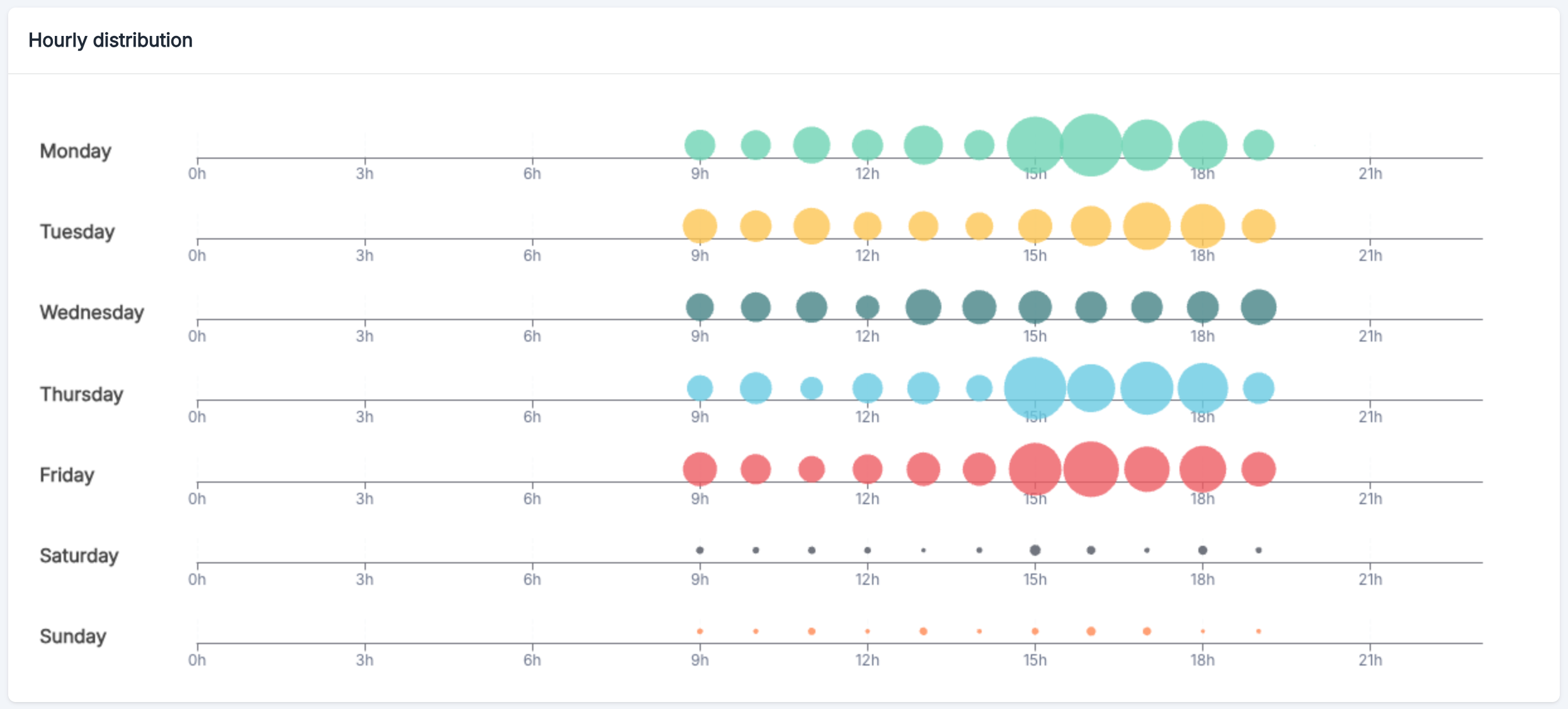
The hourly distribution graph reveals when your customers are most likely to call:
* **Weekdays**: Highest volume between 9 AM and 6 PM
* **Monday, Thursday, and Friday**: Notable peak around 12 PM
* **Weekend**: Minimal call activity
#### Overview
The hourly distribution graph reveals when your customers are most likely to call:
* **Weekdays**: Highest volume between 9 AM and 6 PM
* **Monday, Thursday, and Friday**: Notable peak around 12 PM
* **Weekend**: Minimal call activity